Plotting in Python
Matplotlib, Seaborn, Bokeh, and APLpy
Kevin Gullikson
Outline
- Matplotlib
- Basics
- Latex
- legends
- Annotation
- Multiple axes
- Multiple subplots
- Seaborn: Pretty colors, easy configuration
- Bokeh
- hover tooltips
- linked brushing
- APLpy: Astronomy plotting library
All images and source for this slideshow are available here
Aims to make easy things easy, and difficult things possible.
- Main plotting library
- Almost everyone has it
- Extensive gallery
- Jet == sad panda
Basic Plotting
In [2]:
x = np.arange(0, 2.0*np.pi, 0.01)   # I think the IDL equivalent is findgen...
y = np.sin(x)

fig, ax = pylab.subplots()
_ = ax.plot(x,y, lw=2)

Axis Labels

In []:
ax.set_xlabel('Time', fontsize=15)
ax.set_ylabel('Value', fontsize=15)

Legends + LaTex

In []:
_ = ax.plot(x,y1, lw=2, label=r'$\nu = 1 s^{-1}$')
_ = ax.plot(x,y2, lw=2, label=r'$\nu = 2 s^{-1}$')
leg = ax.legend(loc='best', fancybox=True)
leg.get_frame().set_alpha(0.5)

Annotation

In []:
# Adjust axes
ax.set_ylim((-1.2, 1.3))
ax.set_xlim((0, 2.0*np.pi))

ax.annotate('Peak', xy=(np.pi/2, 1), xytext=(np.pi, 1.1),
            arrowprops=dict(facecolor='black', # Arrow color
                            shrink=0.1,        # Distance between arrow and text
                            width=2),          # Width of the arrow, in points
            fontsize=15)

Adding axes
- For a full example, see what I did here (It uses data on my local computer, so you won't be able to run it as-is)
- Here is the relevent code
In [6]:
def add_top_axis(axis, spt_values=('M5', 'M0', 'K5', 'K0', 'G5', 'G0')):
    # Find the temperatures at each spectral type
    temp_values = MS.Interpolate('Temperature', spt_values)

    # make the axis
    top = axis.twiny()

    # Set the full range to be the same as the data axis
    xlim = axis.get_xlim()
    top.set_xlim(xlim)

    # Set the ticks at the temperatures corresponding to the right spectral type
    top.set_xticks(temp_values)
    top.set_xticklabels(spt_values)
    top.set_xlabel('Spectral Type')
    return top

Subplots

In []:
from matplotlib import gridspec

fig = pylab.figure()
gs = gridspec.GridSpec(2, 1, height_ratios=[3, 1.5])
top = plt.subplot(gs[0])
top.plot(xdata, ydata, 'rx')
top.plot(xfull, yfull, 'k--', lw=2)
bottom = plt.subplot(gs[1])
bottom.plot(xdata, ydata-np.sin(xdata), 'rx', lw=2)
bottom.plot(xfull, np.zeros(xfull.size), 'k--')


Setting Defaults
- ~/.matplotlib/matplotlibrc
- backend : TkAgg
- lines.linewidth : 1.0
- Search github for matplotlibrc files
- See here for documentation
- On top of the script
In [7]:
import matplotlib
matplotlib.rc('lines', linewidth=2, color='r')

# Must edit the rc params before this (or pylab import)
import matplotlib.pyplot as plt
Seaborn
- Aims to make plots prettier by default (jet not even available!)
- As easy as 'import seaborn as sns' on top of script
- Easy colormap changes
- Plays well with pandas
- Also has its own built-in functions for:
- Has its own example gallery
"If matplotlib “tries to make easy things easy and hard things possible”, seaborn aims to make a well-defined set of hard things easy too.


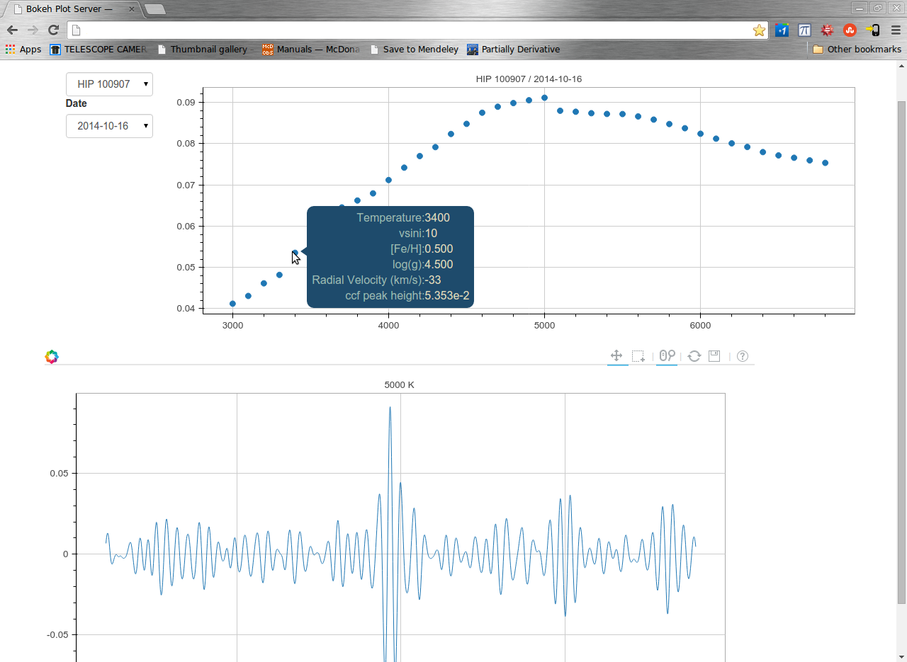
Bokeh
- Make interactive plots via web presentation
- Similar to D3.js but you don't need to know any javascript.
- Hover tooltips
- Streaming large data (eventually...)
- Linked brushing
- Also has a gallery
- Takes a bit more work than seaborn
- Documentation is lacking and/or out of date, but the examples are really useful
- works in ipython notebook with %bokeh "magic"
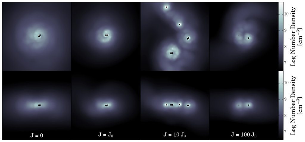
Examples
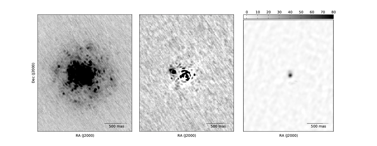
 Credit: Jacob Hummel. Source
 Credit: Jacob Hummel. Source
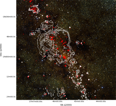
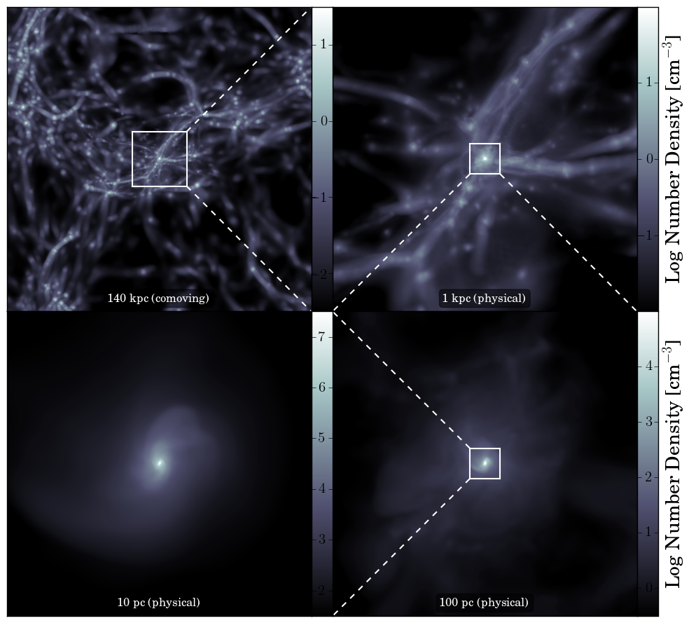
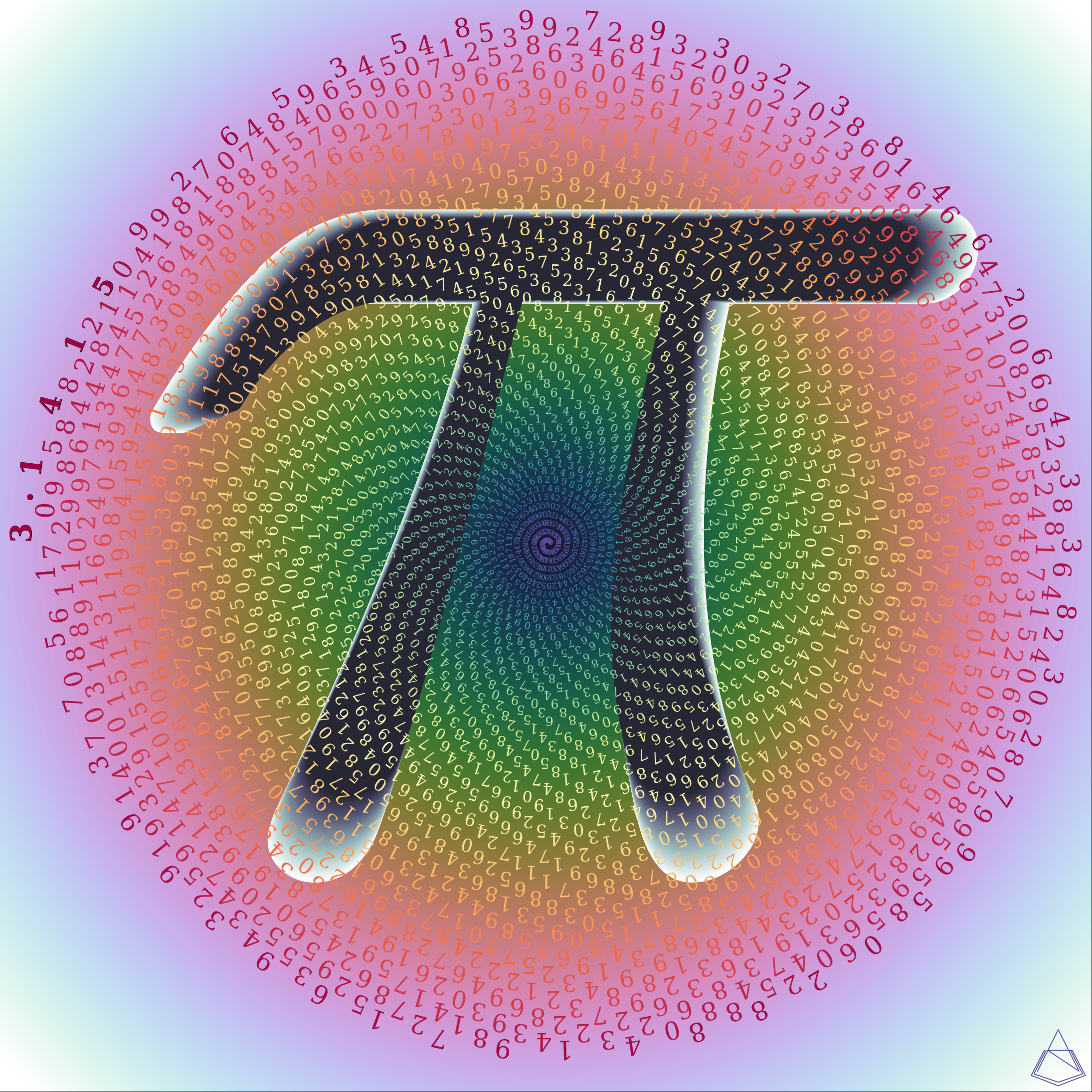 Credit: Aaron Jaurez.
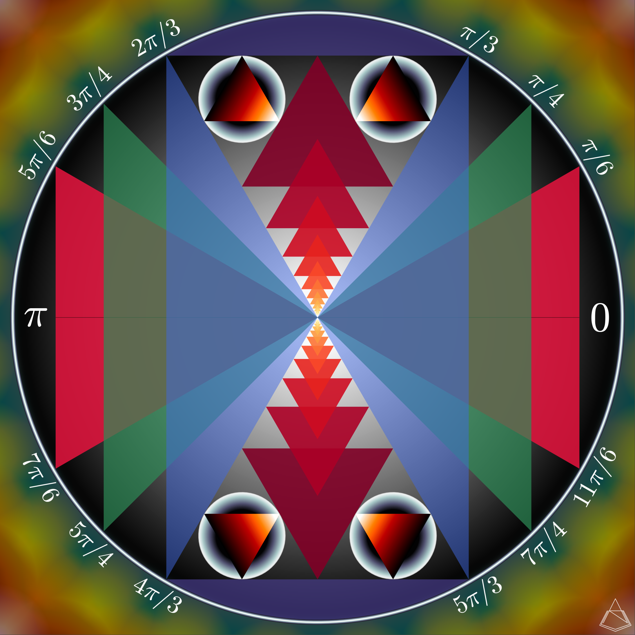
 Credit: Aaron Jaurez.
Conclusions
- For line plots and scatter plots, use matplotlib. import seaborn for aesthetics
- For images, consider APLpy
- For interactive data vizualation, consider bokeh